Expressions
used in a weather report :
•
A high of twenty degrees.
•
A low of -25.
•
20 percent chance of snow.
•
Mainly sunny.
•
Sunny with cloudy periods.
•
Above/below average
temperatures.
•
A few flurries.
•
5-day forecast.
•
Temperatures are going to drop/dip/plunge (go
down quickly).
•
Temperatures are going to
rise/soar/climb (go up quickly).
•
A warm/cold front is moving
in (air from another region is arriving)
Name of Weather :
• Sunny
• Warm
• Hot
• Mild
• Cold
• Freezing
• Cloudy
• Foggy
• Smoggy
• Rainy
• Wet
• Dry
• Windy
• Snow
• Thunder
• Mist
• Blizzard
• Fog
• Hurricane
• Overcast
Example
Weather report Text :
Hello , Good morning. This is erick with
local weather report. It will be foggy this morning in almost all parts
of town , followed by slight showers. Homever , the showers willnot last for a
long time. By early afternoon it will be cloudy until late afternoon , followed
by heavy rain with thunder storm in the evening into the night. Thank you.
Table :
Table
presents facts and figures
in compact form. There are several things that we need to pay attention to.
They are, the table title, row or column labels, information given in
individual cells and information given within rows and columns.
Steps we need to do to read the table:
1. Observing
the table title
2. Observe
the columns in the table
3. Found
significant differences in the data, either the highest, lowest and average
4. Draw
conclusions from the data presented in the table
Example:
NAME
|
CLASS
|
SCORE
|
JENNIE
|
A
|
70
|
THOMAS
|
B
|
80
|
RICK
|
B
|
75
|
JASON
|
C
|
90
|
JESSICA
|
D
|
85
|
JUSTIN
|
B
|
60
|
Graph is a visual concise means of presenting
information.
There are basic kinds of graphs :
1. Bar Graphs
2. Line Graphs
3. Circle or Pie Graphs
Graphs usually find in : clinic , BPS office , Library
.etc
1. Bar Graphs
Bar graphs is a type of graphs which contains labeled
horizontal or vertical bars showing a piece of information and an axis. The
numbers along the side of bar graph compose the axis. This is also called as a
histogram, bar graph is useful when there is a numerical comparison.
2. Line Graphs
A
line graph is a way of representing two pieces of information, which is usually
related and vary with respect to each other. This is useful when comparisons
are needed.
Example :
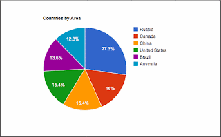
3. Pie Graphs
Cirle graphs (sometimes called pie or circle chart)
are used to show the parts that make up a whole. They can be useful for
comparing the size of relative parts.
Example :


Tidak ada komentar:
Posting Komentar